Pigeon Post Launch
March 17, 2026
Hi friends,
I'm so grateful you're here for the first edition of Pigeon Post. This newsletter has been living in my head for months, and I'm thrilled it's finally real. Before I begin, I want to share a bit about what's been happening in my studio and what you can expect from these monthly letters.
What is Pigeon Post?
I think of it as a way to connect to my community and people who support my work and/or would like to learn more about art with me. I don’t claim to be a master by any means, being self taught and all, but I do have some tips and tricks that might be valuable to some people.
Additionally, I chose to have a newsletter because I realized how much content I was creating for algorithms that I don't control. Social media is great for reaching new people, but it's unpredictable. With email I don’t have to worry if it will reach the audience, because I know for sure that I WILL send that email.
Studio Updates
One of the biggest surprises this year has been my ACEO sales on eBay. For those unfamiliar, ACEOs are tiny art cards (2.5" x 3.5" trading card size)perfect for collectors who want original art at an accessible price point. I started making them after seeing them on TikTok, and decided to join in on the trend and sell them on eBay.
The response has genuinely blown me away. Not just in sales numbers, but in the overwhelming positivity of the reviews. People have been so kind, so enthusiastic about their purchases. Reading those reviews has been one of the most validating experiences as an emerging artist.
What's made this even more special is the care I've put into packaging. In the beginning I’d just put it in a blank envelope, but now every ACEO comes with a hand-stamped card,
a custom "Do Not Bend" stamp I designed myself, thoughtfully chosen envelope colors, and a handwritten thank-you note. Several customers have commented on how much they loved the unboxing experience, which honestly made my day.
Oil Paint: A Beautiful Failure (shop)
I finally picked up oil paint for the first time in my life and got humbled real quick.
I've been working with watercolor and dry media for years. It's my comfort zone, and oil painting is nothing like it. The learning curve has been steep and messy, and during the first couple of painting sessions I was smudging layers beneath my brush strokes, mixing muddy colors instead of vibrant ones, and struggling intensely with detail work. I particularly enjoy making tiny paintings, but that wasn’t possible with oils. That doesn’t mean I won’t keep trying though. You can check out some of the pieces I’m more proud of in my shop.
So expect to see more oil paint experiments in upcoming newsletters. Some will be disasters. Some might turn out okay. Either way, I'm here for the journey.
Color Theory Deep Dive: Mixing Neutrals
This month, I want to share something I’ve struggled with for a VERY long time: color theory and color mixing. Understanding how colors work together literally changed how I think about art. One concept that blew my mind when I first learned it is neutralizing colors: when you mix two colors together, you can create something that contains traces of either color, but if you keep mixing those colors in just the right proportions, you reach a point where you can't see distinct traces of either color anymore. You've created a neutral - a muted version that's the exact in-between.
This is incredibly useful in painting. When you want to tone down a color without adding black (which kills vibrancy), you can mix it with its complement—the opposite color on the color wheel. A too-bright pink? Mix in a tiny bit of green to neutralize it. An overly saturated blue? Add a touch of orange. And this is also exactly how you paint shadows - not by adding black, but by adding the complement of the color over it.
I use this technique constantly now—in my watercolors, in my ACEOs, and I'm starting to experiment with it in oils too. It's one of those foundational skills that makes a huge difference in whether a piece feels harmonious or chaotic.
The Book That Changed My Understanding
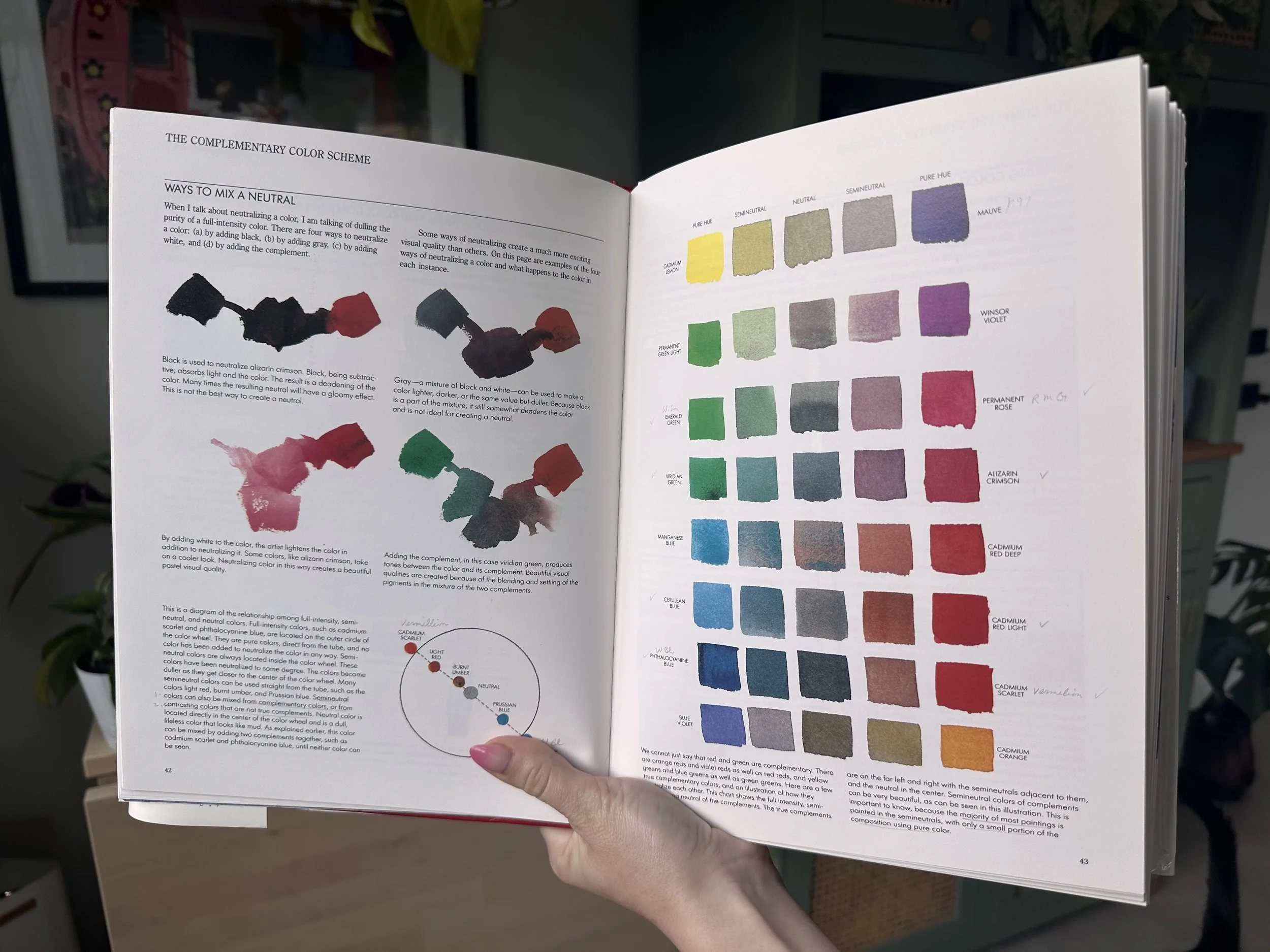
The book that finally made things click for me is Color Choices by Stephen Quiller. Just the first chapter made me go “huh, I never thought of it that way” or “I didn’t make that connection, but that makes complete sense”. It moves beyond just knowing the color wheel and actually dives into how colors interact, and how humans perceive them. It explains why certain colors feel harmonious together, why some palettes feel chaotic, and how to make intentional choices that elevate your work.
What I love most about it is that it's not boring technical stuff. The author connects color theory to emotion, intention, and storytelling. Every chapter has made me want to go back to my studio and experiment. I've been marking pages and taking notes like a student again, which I didn't expect to enjoy this much.
If you're interested in understanding color on a deeper level, I highly recommend picking this up. It's one of those foundational books that will change how you see every piece of art you look at.
What's Coming Next Month
In April’s Pigeon Post, I'll be sharing:
A full tutorial on my ACEO process
An update on my oil painting experiments (hopefully some progress!)
What I'm reading and listening to
More color mixing techniques you can actually use
Exclusive previews of new work before they hit social media
Thank You
Thank you for being here at the beginning of this newsletter. Thank you for supporting my art, whether you've bought an ACEO, followed me on social media, or just decided to show up in your inbox each month. This community means everything to me.
If there's anything you'd like to see in future newsletters, hit reply and let me know. I read every message.
See you next month,
Taliko